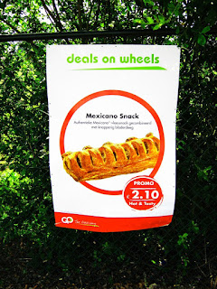
 By adding a little creative flair to your banners, you can differentiate the banners that you produce from the more commonplace banners that your competitors produce. One of the objectives of any good sign design is attracting attention. Any sign competes daily with the myriad of visual images that bombard the consumer. For any design to stand out against a background of visual clutter, it must be distinctive.
Make Your Message Short & Sweet. The first principle of good banner design is simplicity. Don’t use eight words, when four will do. This principle also applies when designing any sign, outdoor advertising and fleet graphics.
Typography. Many of the exotic and ornate typefaces project an upscale, elegant look, but just are aren’t legible. In selecting a typestyle, it’s best to stick with a simple, sans serif font. One test you can apply to any signage copy is: can the viewer read the message as they drive by the sign or banner?
Many designers hate using sans serif fonts, such as Helvetica. They feel that using the commonplace type style is unimaginative. Like it or not, these typefaces are more readable from a distance than the more decorative serif fonts. Like any other sign, viewing time is only matter of seconds. So control your artistic urges when selecting type styles, and select a style that does the best job in transmitting your message. Read more »


