A Horse Of A Different Color

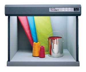
A light booth is indispensable for color matching. To aid in evaluation of color quality and uniformity, X-Rite’s Judge II-S Viewing Booth is equipped with five selectable light sources: Simulated Daylight (D50), Cool White Fluorescent (CWF) at 4150K, Illuminant “A” (Incandescent) at 2856K, Custom Fluorescent (TL84 or Ultralume 30), Ultraviolet (UV).
Colors can change in appearance under different lighting conditions. To understand how, let’s first explain the concept of reflected color. The color that we perceive is light that reflects off the object that we are viewing. White light, which is the combination of all wave lengths of color, travels through the transparent inks (cyan, magenta, yellow) on the surface of the print. Some wavelengths of light are absorbed or subtracted from the light as it passes through the ink. The remaining light bounces or reflects off of the print media through the ink again and to our eyes. The receptors in our eyes detect three of the frequencies of light: red, green and blue. Our brain responds to the messages from these receptors to create our perception of color.
The ink colorants on the surface of a print certainly are important to the color that we see. But there are a couple of other factors that affect the perceived color. One factor is the color of the substrate. Printers know that white is not white is not white. That’s why white substrates are rated in terms of their brilliance. An even more important factor, however, is the light that reflects off of the print.
In a perfect world, the various electromagnetic wavelengths that comprise light would all be at full intensity to produce a pure white. Not too much in this world is perfect. Light can be biased toward a certain part of the spectrum, and can impart a reddish, yellowish, bluish or greenish cast to what we are viewing.
The light, that an incandescent light bulb with a tungsten filament emits, for example, is yellowish. On the other hand, the light from a fluorescent bulb can appear bluish or greenish. If you step outside, natural light appears much different than either the tungsten light bulb or the fluorescent lighting. And depending on the time of day, the lighting can vary in color. Lighting at high noon is more of a purer white than that when the sun is on the horizon.
These subtle changes in light may not be noticeable with the naked eye, because our eyes tend to compensate for the variances. The result is that for most people, white light will all appear the same. As for the object that the light illuminates, these subtle variations in hue can stick out like a sore thumb. This is why lighting makes color matching difficult, frustrating and quite often time-consuming.
Photographers of old, who shot film, were very aware of the quality of light. If you were photographing under fluorescent light, and had film balanced for daylight, the resulting prints would appear greenish.
Early in my indoctrination in the screen print industry, I was taught to ask the client under which lighting conditions would the graphic be viewed. Based on the application, colors were mixed and matched against a color sample. To accurately compare the colors, samples were viewed in a color light booth.
This light booth had several light sources under which comparisons were made. I have seen two colors that appeared to match perfectly under incandescent lighting, look very different when the light was switched to artificial daylight. I have also seen one color look darker than another under one type of light, suddenly appear lighter when the light source was changed.
Obviously, most colors do not radically change their appearance as the light source changes. Otherwise, everybody would be aware of this phenomenon. Those colors that do change dramatically are referred to as being metameric. To prevent metamerism from occurring, manufacturers use additives to their ink formulas to prevent color shifts. Just be aware that it is possible for colors to shift their hue as light changes, and this is more common with neutral colors, such as grey.
As seen on hingstssignpost.blogspot.com


