Painting a scene is a challenge for most people. Now, imagine painting everything in reverse. It can be mind-boggling. As I struggled with the learning curve, I soon realized that I needed help. I was fortunate to have some veteran sign painters coach me through the process of reverse painting on glass. If you are up for the challenge, please read on as I chronicle what I learned.
The History. The Germans call it “Hinterglasmalerie”. That mouthful literally means “behind glass painting”. While reverse painting on glass has been practiced throughout Europe since the 1500s, 19th century Austrians, who didn’t enjoy schlussing down the ski slopes, popularized the pastime as indoor winter activity.
Up until the enactment of the 18th Amendment to the Constitution, barroom signs in the late 1800s and the early 20th century were often decorated with reverse glass paintings. Prohibition ended the legal production, transport and sale of alcohol along with the art of glue chipped and painted glass signage.
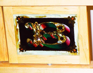
The new American Sign Museum, which recently opened in Cincinnati, OH displays many turn of the century glass signs, which were decorated by painting in reverse on the backside of the glass.
Today, production of handcrafted glass signs is very time-consuming, costly and in most cases commercially impractical. Only a few remaining practitioners sell their work as signage. A much more lucrative enterprise is to market reverse glass painting to an affluent clientele as artwork or as decorative glass for interior décor. It’s all about positioning! If you don’t believe me, visit an art gallery. You will be amazed at the prices that artwork commands. Is it any better than the craftsmanship that I have seen in the sign industry? No way! But, it’s “art”.
Reverse Painting on Glass. Normally in painting, many painters begin with big, bold, broad strokes, blocking in the primary subject matter with the background elements and building the shadow areas. Once the key elements are established, you will add in the mid-tones, which define the basic shapes within the composition. Then come the finishing touches: the highlights and fine details.
When painting in reverse on glass, you begin painting the very small highlights, the fine details and the darkest shadows, which you would normally paint last in a composition. The next step is to gradually add in the mid-tones, working from the light areas to the darker ones, building the values which model the subject and create its three-dimensional form. The final step is to add in the remaining shadows and background elements.
Proper Prior Planning. Before you start painting, proper prior planning can help you save time and avoid mishaps. Planning involves assembling the supplies that you need and, most importantly, thinking through the job before you start.
Supplies: Most of what you will need for reverse painting on glass you will most likely already have in your shop. The following list below itemizes these basic tools and supplies:
- Paint. (For exterior applications, use either sign enamels or Japan paints. For interior applications, oil paints are acceptable.)
- Medium (If you are using enamels or Japan paints, you can use a linseed oil/turpentine mixture. For oil paints, use a commercial medium, such as Liquin.)
- Thinner (such as turpentine)
- Brush cleaner (such as mineral spirits)
- An assortment of brushesPalette knives
- Palette
- Easel
- Mirror
- Color Wheel
- Absorbent paper towels
- Latex gloves
Mediums: In the sign industry boiled linseed oil is used to promote faster drying. Many old timers will mix their own medium, using one part linseed oil with three parts turpentine. Boiled linseed oil is generally safe for use with sign enamels or oil paints, because most of these paints use linseed oil as a binder or resin. As a paint additive, boiled oils will dry faster and produce a glossier finish. The downside of boiled oils is that over time these oils will yellow and darken. It will also alter the color of the paints, especially whites, light colors and blues.
When using a linseed/turpentine mixture or any other medium, keep the following facts in mind. The more medium you use, the more you dilute the color. The color also becomes more transparent and durability is compromised.
In mixing a linseed/turpentine mixture, you can alter the proportions. As you increase the amount of linseed oil, the medium is referred to as becoming fatter. As more turpentine is added, the mixture becomes leaner. Too much turpentine though can cause the pigment to break down. For this reason, you should never use more than 50% of any thinner in your medium.
The rule of thumb is to paint fat over lean. Failure to observe this widely-held maxim can result in the paint cracking or wrinkling. You can further modify the linseed/turpentine mixture by using driers, either a cobalt drier or Japan drier, to accelerate the curing process. (More on driers to follow.)
If you use oil paints for an indoor application, you will find that these paints dry much more slowly than sign enamels or Japan paints. This extended open time allows you to blend colors and rework areas of your painting. The disadvantage is that oil paints can take days to dry. Reds, blues and purples dry especially slowly, compared to the earth tones.
Commercial mediums, such as Winsor Newton Liquin, are generally fat mediums, compared to linseed oil/turpentine mixtures, which are relatively lean. The advantage of a fat medium is that it has a prolonged open time. This allows you the time to rework your painting over a few days. If you want your painting to dry in a day or two, use a lean medium.
Driers: The evaporative process causes an oil paint to dry. Curing, though, is a completely different process. Curing refers to the polymerization of the resin, which occurs as the paint oxidizes and simple molecules crosslink to form more complex molecular structures.
By attracting oxygen into paint, a cobalt drier accelerates drying times. When adding any drier to paint, use care. As little as a drop or two added to a medium is all you need. As a rule of thumb, limit the amount of drier to less than 5%. Adding too much drier can cause problems, such as wrinkling, yellowing and cracking. Cobalt driers can also alter the hue of paints, especially white.
Many of the old sign makers use Japan driers to speed up paint drying. The question that you need to ask is whether a drier is really necessary. If you are using a linseed oil/turpentine mixture as a medium, it will already accelerate drying.
Thinners: As a thinner many painters prefer the old fashioned turpentine. Some people prefer mineral spirits. Be aware that not all mineral spirits are created the same. Formulations vary from one manufacturer to another. Some formulations can alter the color of paints. Before using mineral spirits the best practice is to “Test Don’t Guess”. Put a few drops on a white piece of paper. If it leaves a stain it is not suitable as a thinner.
Turpentine: The old timers swear by turpentine. As a solvent, it is compatible with oil paints and sign enamels. While it is a natural tree resin product, do not be fooled in thinking that it completely safe. Breathing the solvent fumes is harmful to your health and turpentine will absorb through your skin and into your bloodstream. Also be aware that the properties of one brand of turpentine can vary greatly from those of another. If you are a purist and want a pure product, buy the artist’s grade. It should be water clear. Most likely, the variety that you will find at your local hardware store will have some impurities.
Mineral Spirits. While you can use mineral spirits as a reducer, turpentine and Liquin may be better thinners. For cleaning, mineral spirits is a great solvent, that won’t harm your brushes, especially the more expensive natural hair brushes. Do not use lacquer thinner as a cleaner. It can ruin your brushes.
Palette: Regardless what type of paint you use, you will need some type of palette for mixing colors. Theprototypical oval-shaped artist’s palette is not very practical, because its size limits the area that you have to mix colors.
Using a sheet of glass for a palette is much more utilitarian. On the backside of the glass, mask the surface with paper application tape. The white background of the application tape will help you better evaluate the colors that you are mixing. Glass palettes are popular because you can easily scrape off any dried paint with a razor scraper.
Another option is to use a porcelain palette in the shape of a cookie pan. On the bottom of the pan, apply clear application tape, such as RTape AT60, to cover the entire area. At the time of clean up, just peel the tape from the surface and discard it.
Tip: If you are using oil paints and want to keep the colors that you have mixed, cover the entire pan with Saran kitchen wrap and store the pan in your freezer until the next use.
Palette Knife. Mix your colors with a palette knife, not with one of your brushes. Here’s why. A brush can contain residual paint that can dirty the paint color in the mixing process.
Color Wheel. If you have the three primary colors (red, yellow and blue), you can theoretically mix any other color you need. Before you can do that, you must understand the relationship of one color to another. A color wheel helps you understand those relationships and arrange the colors of paint on your palette.
Latex Gloves. If you paint regularly, protect your skin with latex gloves. If you are allergic to latex, first put on thin cotton gloves before putting on the latex gloves. Prolonged exposure to solvents can result in contact dermatitis, which is generally described as an inflammation of the skin. In reality, it is much worse than it sounds. Redness and itchy skin are the mild symptoms. In severe cases, you can develop rashes, blisters and lesions. It isn’t a pretty sight.
Surface Preparation. How can you know whether a particular paint will stick on glass? What’s critical for good paint adhesion is clean glass. When you are painting on the inside of a window in a restaurant or bar, you may want to take extra care before painting. Some sign painters will prep the glass with PrepSol or a Wax and Grease Remover, followed by a final wipe with IPA. Still others clean the surface with acetic acid (white distilled vinegar).
Picture perfect? Good photography is generally great for reference in creating a painting. It is a great aid in capturing the lighting and color of the subject matter and rendering the composition in correct proportion. By desaturating the picture in Photoshop, you can also very easily map out where the highlights, midtones and shadows are within a scene.
Many photos, however, are too flat because the subject is lighted from multiple light sources, arranged at different angles. Often the lighting is just not natural and you lose much of the contrast between the highlights and shadows, which model the subject, creating the three-dimensional appearance.
While pictures are good for reference, you will need to use your artistic judgment in deciding which elements to use and not use in your composition. You will also need to use artistic judgment in color selection and how you intend to render the elements of your design. Pictures are a great help, but rarely picture perfect.
Even with professional photography, it can’t hurt to sketch the composition first. Drawing can help contemplate light direction, and the arrangement of the basic planes and shapes that comprise your composition.
Lighting: The direction of the light source determines the highlights and shadows in the painting. Consistency is critical. Make sure that the light source illuminates the subject matter from the same direction. Throughout the time that you are painting, you must continually remind yourself where the light source is.
If you do a preliminary drawing, a good practice is to draw an arrow indicating the light direction right on the sketch.
Using your Sketch for Painting. If you are painting first surface, you can sketch directly on the substrate. You typically will not do this when painting on the back of a glass panel. The next best thing is to tape the reverse image on the first surface or front of the glass. The thickness of the glass can distort your perception of the drawing and throw you off a bit as you are trying to duplicate the image. This error in lining up the image accurately is commonly referred to as “parallax view”.
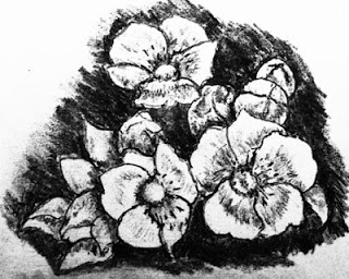
Preliminary sketch.
Which Colors to Buy. A third consideration is color. You don’t need to buy every color that a paint manufacturer makes. With a few primary colors you can virtually mix any color that you need.
Much of you time should be devoted to mixing colors before the paint brush touches the substrate. It is always better to mix colors on your palette rather than trying to modify the hue and value of a color on the painting itself. This is especially true if you are painting in reverse on glass.
After mixing the colors, you may also want to do a thumbnail painting, so you can check how the various colors interact with one another in the composition. Make sure that as you are mixing the different colors for the highlights, shadows and midtones, that there is sufficient contrast among the colors. Otherwise, if the colors are too close to one another in hue and value, everything will run together in one big blob of color with no clearly defined shape.
In selecting colors for your palette during the mixing stage, refer to your color wheel. Generally artists will not use black in mixing a shade for the shadow areas. Instead, pick the opposite or complementary color on the color wheel for the darker shade. Contrast in color and value also creates more visual interest.
Test Painting. After you mix the colors that you want on your palette, do a little thumbnail test painting laying one color next to another. That way, you can tell if you have achieved the desired color contrast. A color thumbnail will also reveal how the various colors interact with one another in achieving the overall effect.
How to Organize your Palette. At the top of your palette, arrange your primary and secondary colors from the warmest to the coolest. Also include white in this arrangement.
You may not need every primary and secondary color. Just select the dominant colors in your composition, as well as the adjacent primary and secondary colors on the color wheel, along with the complementary colors and white.
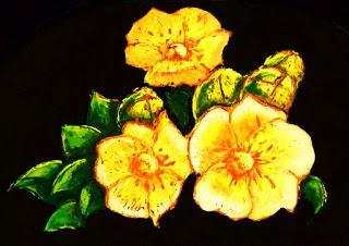
In the pictorial of the yellow flowers, yellow was the dominant color. The adjacent colors on the color wheel are green and orange. The complement of yellow is violet. The dominant color of the leaves is green. The adjacent colors are yellow and blue. The complement of green is red.
As it turned out, my painting required all of the primary and secondary colors plus white. Once I laid out the basic colors on my palette, I was able to mix any intermediate color in any tint or shade.
Tip: Make sure that the surface of the palette that you use is large enough to mix all of the colors that you will need.
Using Mediums. When painting, you can use mediums in one of two ways. You can mix it directly in with your colors on your palette. Or you can apply the medium to the substrate and paint on the coated surface.
For painting on glass, typically the medium is mixed in on the palette. As well as accelerating the drying process, the medium will act as a thinner. If you still need to lower the viscosity of the paint, you can add a little turpentine.
In painting one layer over another, each coating should be thicker, so they will dry more slowly. That way the first layer of paint will dry first. If the top layers dry before the bottom layer cures, the bottom layer won’t cure properly, which could result in cracking.
Painting Sequence. When you are painting first surface, you will block out the primary subject matter by painting the background. After painting the dark shadows of the composition, you will add in the lighter values. The finishing touches are the highlights and the details.
When you paint in reverse on glass, you do the exact opposite. You start by painting the details and the highlights. Then you paint the objects in the foreground and then finish by painting the background.
Conclusion: Once you have painted on glass, you will see that while it requires concentration, it is not impossible. The major challenge is getting started. Fear of failure is generally the cause of any procrastination. The good news is that you are painting on glass. If you screw up, don’t worry about it. It’s only paint. Just scrape it off and start over.


