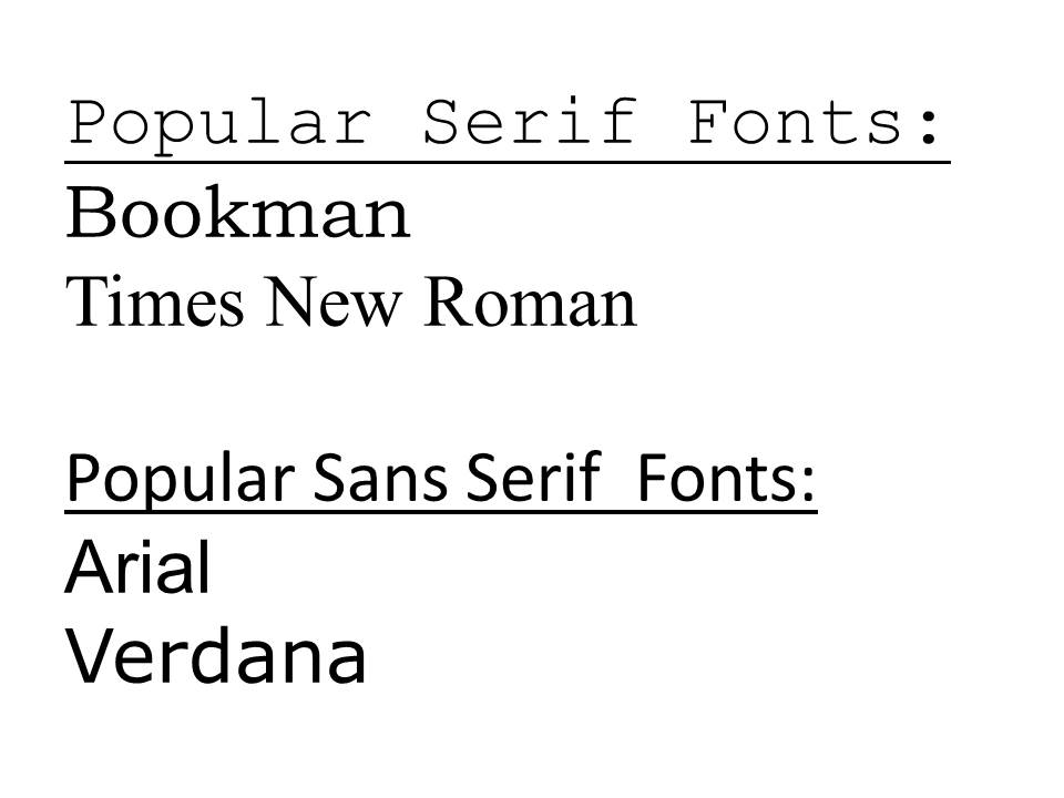
Readability and Legibility
When I worked in advertising, 40 years ago, I was taught that a serif type, such as Times Roman, was more readable than a sans serif type because the first words that we read in elementary school primers are in that family of typeface. The morning newspaper is also set in a serif font. We are more familiar with this font, and more comfortable when reading it. Readability, however, isn’t the same thing as legibility. Times Roman may be more pleasing to our eyes, but that doesn’t make it more legible.
So what do we mean by legibility? The legibility of the typeface is that you use is also important. Sans serif fonts generally can be read more easily at a distance than fonts with serifs. Serifs are those small embellishing strokes that finish off the main strokes of a letter. That doesn’t mean that you should always use sans serif copy. On the contrary, most designers will argue that typefaces with serifs are more likely to be read, because they are more pleasing to the eye. And they’re right!
Bigger is Better.
As with other things in life, size matters. Especially when your sign is viewed at a considerable distance. The distance, at which a sign is viewed, determines the character height of the copy that you should use. One standard is that one-inch copy can be read at a distance of 50 feet. I don’t know who dreamed up that rule of thumb, but their eyesight must be that of an eagle. The rule that I was taught was that for every inch of character height you get twenty-five feet of readability. I think that you’re safer with that rule!
Viewing distance is just one consideration. For on-premise signage you also need to consider the speed at which traffic is moving past the location.
In addition to making your copy bigger, also use a typeface with a bolder stroke. Outlining and drop shadow can also improve readability.
Contrast Improves Readability.
Metallic vinyls, such as smooth gold and silver, gold leaf, and silver and gold large engine turn, are popular but not always readable. Using a heavy black drop shadow can create just the right contrast to improve readability. Although black is frequently used for drop shadows, it isn’t the only color that you should consider. For example, if you are using gold lettering on a bright red background, try using a dark red for the shadow. The dark red will soften the transition from the gold in the foreground to the red background.
Contrasting colors usually aid readability. Some of the most readable color combinations include:
- Black on yellow
- Black on white
- Yellow on black
- White on black
- Blue on white
While using contrasting colors can improve readability, contrast in line value, typeface and shape can attraction the viewer’s attention and differentiate your signage from that of your competitors. Using script with big block lettering was a frequently-used and effective technique of the paint and brush generation. While variations in typefaces can be interesting and attract attention, using too many different fonts is distracting. Usually two different typefaces are enough.


