Many of the basic rules for designing outdoor advertising and transit advertising are also relevant when you design vehicle graphics. The cardinal design rule is: Keep It Simple.
Customers understandably want to get their money’s worth. So they tend to want to cover every inch of the vehicle with numerous different advertising messages. The result is usually a cluttered and confusing mess.
Your job is to convince them that less is more. Limit the number of words to a maximum of six. Use a legible typeface, and incorporate bright or contrasting colors to attract attention.
“Too many words, too many colors and too many design elements can create visual clutter and detract from your primary message,” says New Jersey sign maker, Julian “Mr. J” Braet. “Good fleet graphics should communicate who you are, what you do and how your audience can get a hold of you.”
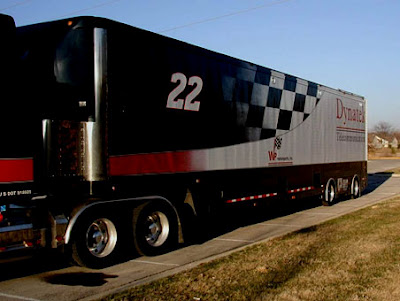
By keeping your designs simple, you will make applications easier and your graphics will have greater visual impact. Limiting your design to three or four primary elements is most effective. According to Mr. J, the most important elements in fleet graphics design include the company name and/or logo, the company slogan and a product picture that communicates what you do as a business. Trim and accent striping can help visually tie the design elements together. Of course, don’t forget the company phone number and website.
“Big, bold, uncluttered graphics are more readable,” says Mr. J. “This is especially important in designing vehicle graphics, because your message is not only viewed at a distance, but it’s usually moving too.”
When determining the location of copy on a vehicle, avoid such obstructions as door hinges, indentations, handles and compound curves, if possible. It’s best to locate text flat surfaces, such as the vehicle’s sides, hood and trunk. If you stretch the copy across a flaring, front-quarter panel or bumper, the lettering will likely become distorted, which hampers visibility.
In many cases, it’s easier to produce the background and the copy as separate design elements. That way you can apply the computer-cut copy as an overlay. This allows you to adjust the positioning of the lettering to avoid obstructions, such as mirrors, louvered vents and doors.
Vehicle templates can greatly aid the layout process. But they are no substitute for conducting an on-site survey. In conducting vehicle surveys pay careful attention to the condition of the paint job. Is the paint a factory finish or a repaint job? Is their damage to the vehicle, that requires repair?
When inspecting a fleet of vehicles, Chuck Bules, of Arlon, advises verifying all measurements and taking pictures of each side, from every angle. Measurements are critical because you need to know how much live area you have available for the graphics.
Vehicle templates save a tremendous amount of time. But there can be discrepancies between what appears on a two-dimensional computer screen and the actual measurements on a three dimensional vehicle surface.
“Vehicle graphics is business of details,” says Bules. “There are so many variables in designing, manufacturing and installing that can make or break a program. When you miss one of these details, it can cost you money.”
In arranging the key elements of your design, first decide which is most important. Then determine where to position that primary element in the composition to give it the most prominence.
One way to attract attention to you focal point it to place that item slightly off center. Another technique is to make the most important element of the design bigger than all of the other elements. This helps set the primary element of the design apart from the other elements and attracts attention to it. As the Japanese say, “the nail that sticks out, gets hammered.”
All of the other elements in the design should complement the focal point. Make sure that the other elements don’t compete with or steal the attention from what should be the center of attention.
 Many popular textures are available in software packages for use as backgrounds. Avoid the temptation to throw in everything along with the kitchen sink into your design. Busy backgrounds often distract from the primary message and design elements.
“It’s much better to select lighter colors for backgrounds, such as a picture of clouds, sandy beaches or ocean water,” says Arlon’s Bules. “Fuzzy backgrounds, with fewer defined points of alignment, are much easier to match, when joining one graphic panel with another. You have much less room for error when you join panels with deep colors and highly defined images with multiple points of alignment.”
About the author . . .
Jim Hingst, is a recognized authority in the field of vinyl graphics application. In Vinyl Sign Techniques, Hingst provides a comprehensive guide to the vinyl graphics business. Built around his firsthand experiences working for major fleet graphics screen printers and pressure sensitive manufacturers, Hingst offers a perspective on the vinyl business that thoroughly covers sales and marketing, materials, fabrication, and installation and removal of vinyl products of all kinds. Vinyl Sign Techniques has something for everybody in the vinyl graphics business. Hingst’s book, provides ideas and techniques for graphics fabricators and installers along with advice for executives and salespeople that will result in higher sales and profits.
As seen on hingstssignpost.blogspot.com.


